 BULLSTAR
Chart patterns are the shapes price leaves behind as buyers and sellers fight for control. They don't predict the future, but they help you understand what the market is doing right now and where the next move is more likely to start.
This guide walks through the concepts and patterns crypto traders use most, each with a visual example. Read them in order: the first sections are the foundation that makes every pattern after them more reliable.
1. Start With Multiple Time Frames
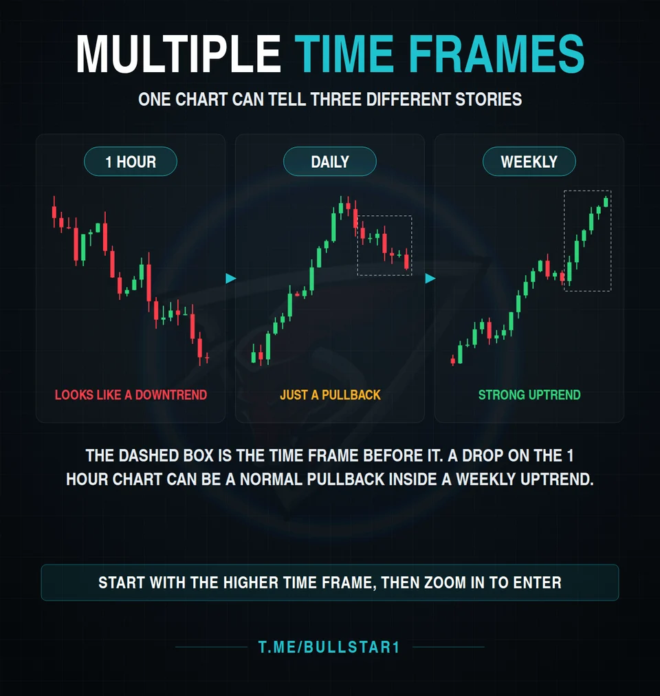
The same chart can tell three different stories. A sharp drop on the 1 hour chart can look like the start of a downtrend, while the daily chart shows it is only a pullback, and the weekly chart shows a strong uptrend that is still intact.
That's why experienced traders read the market from the top down. Use the higher time frame to decide the direction, then zoom into a lower time frame to find a precise entry. Trading against the higher time frame is possible, but it should be a deliberate choice, not an accident.
2. Confluence: One Reason Is a Guess
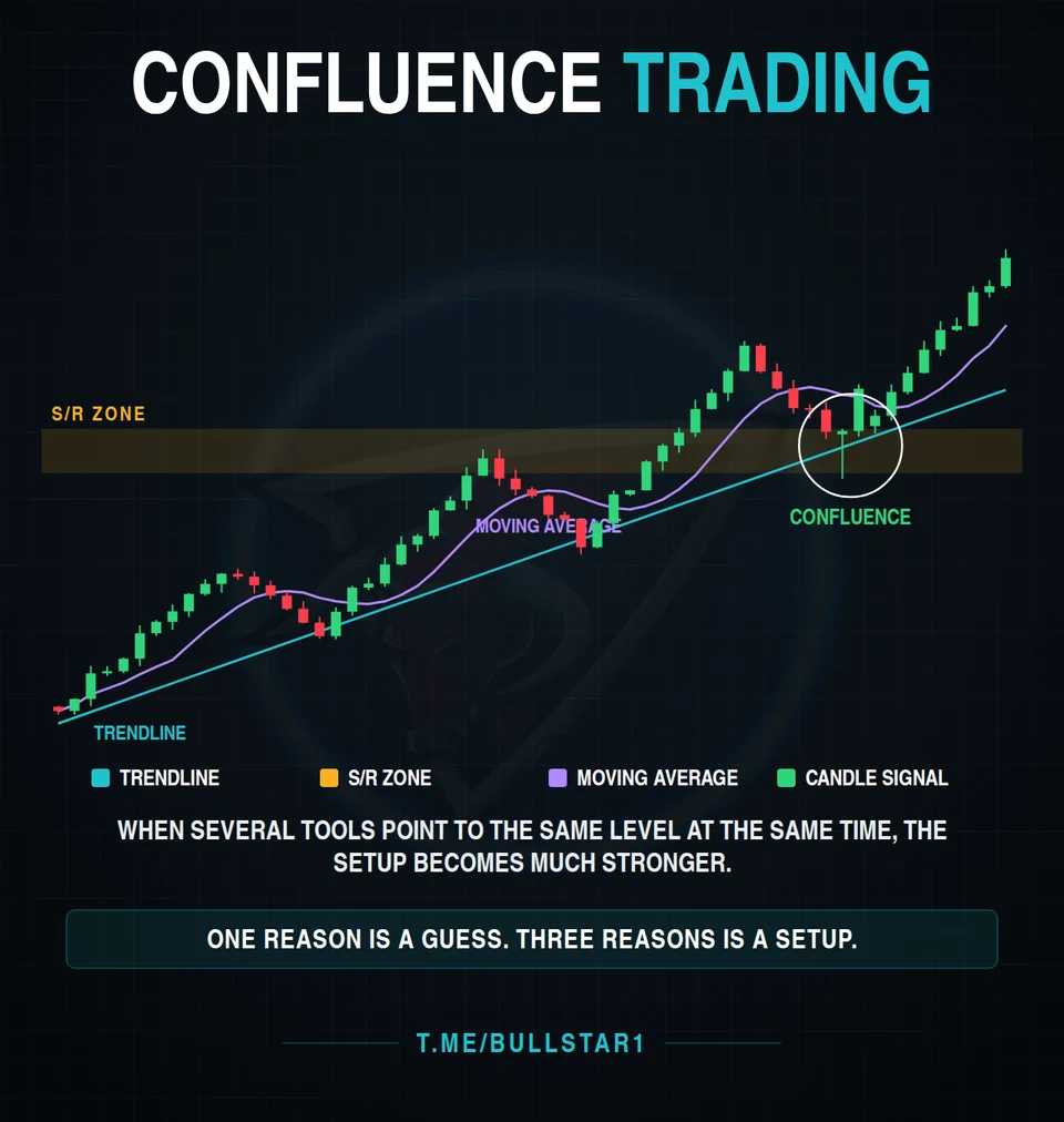
Confluence means several independent tools point to the same price area at the same time. For example, an uptrend line, a support and resistance zone, a moving average and a bullish candle all meeting at one level.
Each tool on its own is weak. Together, they turn a guess into a setup. Before entering a trade, try to list at least two or three reasons for it. If you can only find one, it's usually better to wait.
3. How Strong Is That Supply Zone?
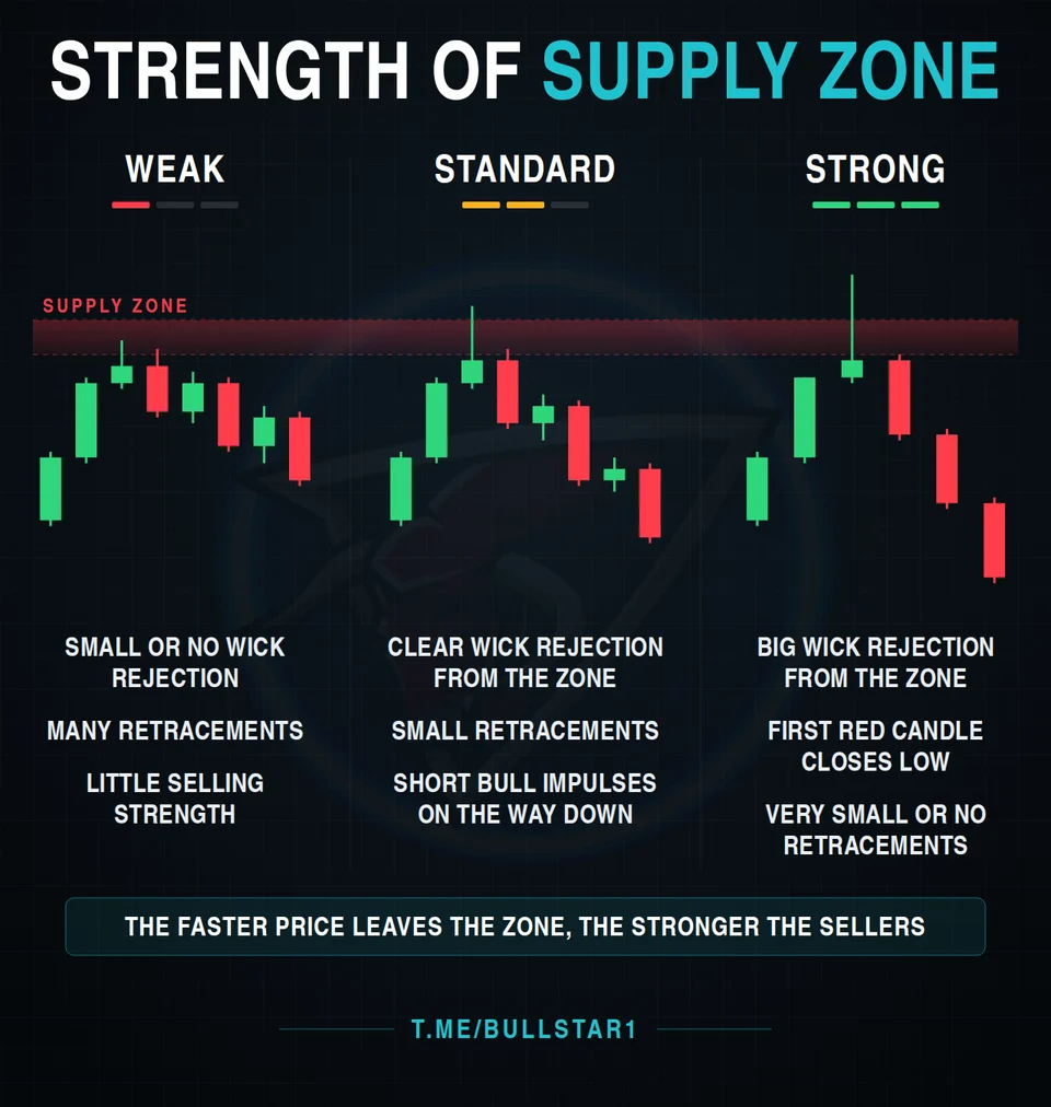
A supply zone is an area where sellers stepped in before and pushed price down. Not every zone is equal, and how price reacts tells you how strong the sellers really are:
- Weak: small or no wick rejection, many retracements, little selling strength
- Standard: a clear wick rejection, smaller retracements, short bullish bounces on the way down
- Strong: a big wick rejection, the first red candle closing near its low, and very small or no retracements
The simple rule: the faster price leaves the zone, the stronger the sellers behind it. The same logic works in reverse for demand zones.
4. Fakeouts: When the Breakout Is a Trap
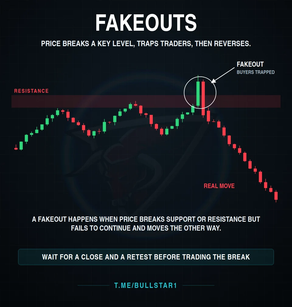
A fakeout happens when price breaks a key support or resistance level, pulls in traders who jump on the breakout, and then reverses hard in the other direction. Breakout buyers end up trapped, and their stop losses fuel the real move.
The best protection is patience. Wait for a candle to close beyond the level, then wait for price to come back and retest it. A level that holds on the retest is far more trustworthy than a single spike through it.
5. Hammer and Hanging Man: Same Shape, Opposite Meaning
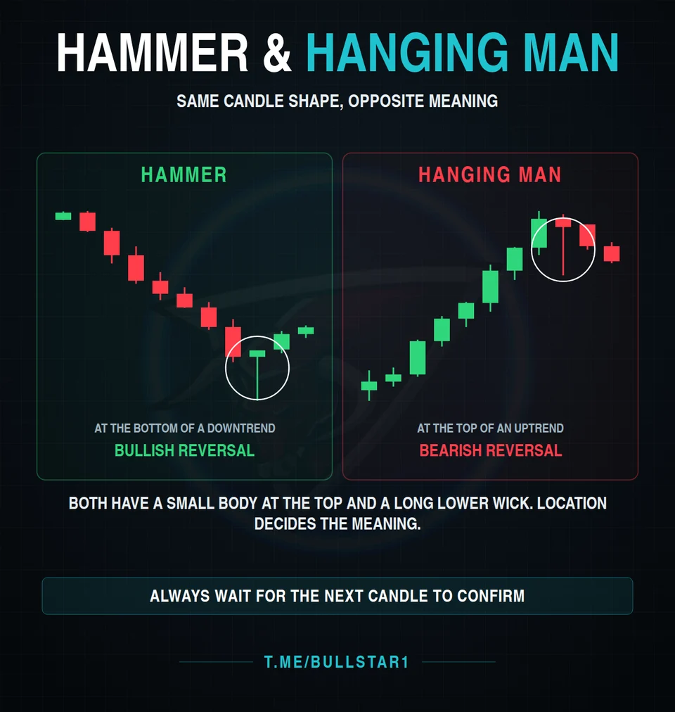
Both candles have a small body near the top and a long lower wick. What makes them different is where they appear:
- Hammer: forms at the bottom of a downtrend. Sellers pushed price down, but buyers took it back. Potential bullish reversal.
- Hanging man: forms at the top of an uptrend. It shows sellers are starting to test the market. Potential bearish reversal.
Location decides the meaning, and one candle is never enough. Always wait for the next candle to confirm the direction before acting.
6. Evening Star: A Three Candle Warning
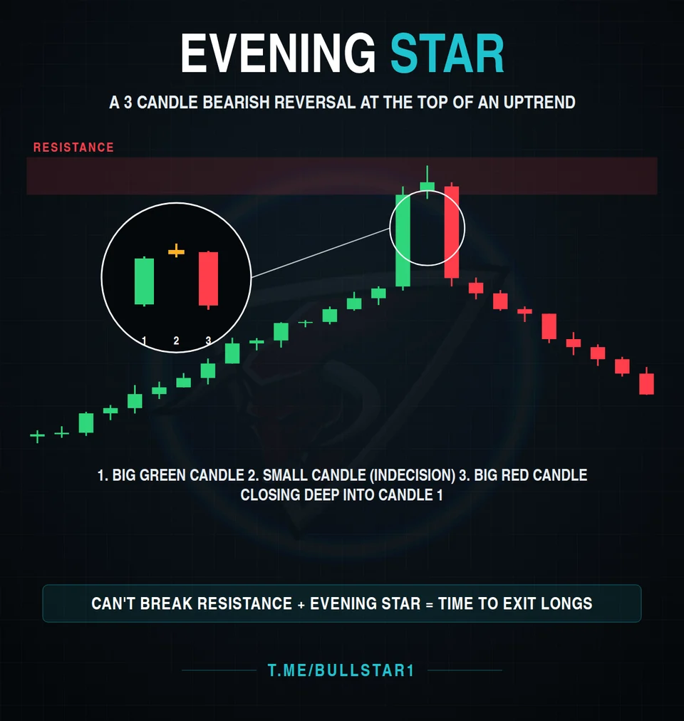
The evening star is a bearish reversal pattern that appears at the top of an uptrend, often at resistance. It has three parts:
- A big green candle, showing buyers still in control
- A small candle, showing indecision
- A big red candle that closes deep into the first candle
When price can't break resistance and an evening star forms there, it's a strong signal to protect profits on long positions or stay out of new longs.
7. Triangle Patterns: The Squeeze Before the Move
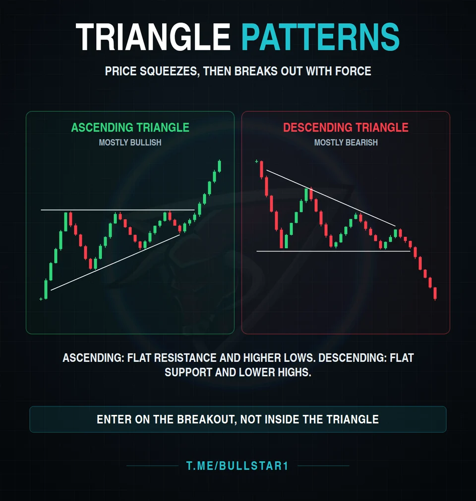
Triangles form when price gets squeezed into a smaller and smaller range before breaking out with force:
- Ascending triangle: flat resistance with higher lows. Buyers keep getting more aggressive. Mostly bullish.
- Descending triangle: flat support with lower highs. Sellers keep getting more aggressive. Mostly bearish.
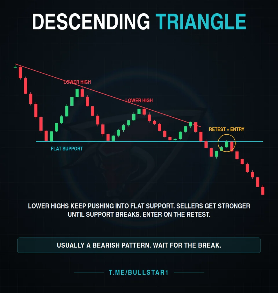
In a descending triangle, each lower high pushes back into the same flat support until that support finally gives way. A common approach is to wait for the break, then enter on the retest of the broken support from below.
Whichever triangle you trade, the rule is the same: enter on the breakout, not inside the triangle. Inside the pattern, price can bounce either way.
8. Head and Shoulders
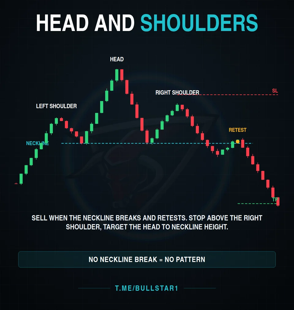
One of the best known reversal patterns. After an uptrend, price makes a high (left shoulder), a higher high (the head), and then a lower high (right shoulder). The lows between them form the neckline.
- Entry: when the neckline breaks, ideally after a retest from below
- Stop loss: above the right shoulder
- Target: the height from the head to the neckline, projected down from the break
Until the neckline breaks, there is no pattern, only a possibility. Many traders lose money by shorting the right shoulder too early.
9. Double Bottom: Principle vs Reality
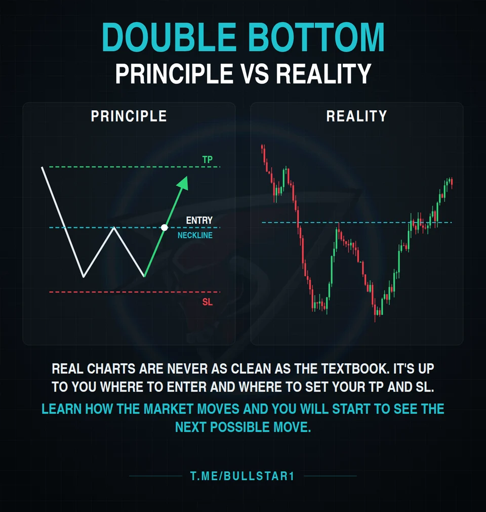
In the textbook, a double bottom is a clean W: two lows at a similar level, a neckline in the middle, an entry on the neckline break, a stop loss below the lows, and a target above.
Real charts are never that clean. The two lows are rarely equal, the neckline is messy, and price often chops around before it commits. That's why pattern recognition is only half the job. The other half is deciding where to enter and where to place your take profit and stop loss based on what the chart actually shows, not on a perfect drawing.
Final Thoughts
None of these patterns work every time, and none of them should be traded on their own. They become useful when you combine them: the higher time frame gives the direction, confluence confirms the level, and the pattern gives the trigger.
Learn how the market moves, practice spotting these shapes on past charts, and always know your stop loss before you enter. Over time, you will start to see the next possible move before it happens. For more on protecting your account, read our 5 risk management rules for signal followers.